Garage Bar

Have you ever thought about remodeling your garage? Or maybe just adding in a few personally designed pieces for convenience?

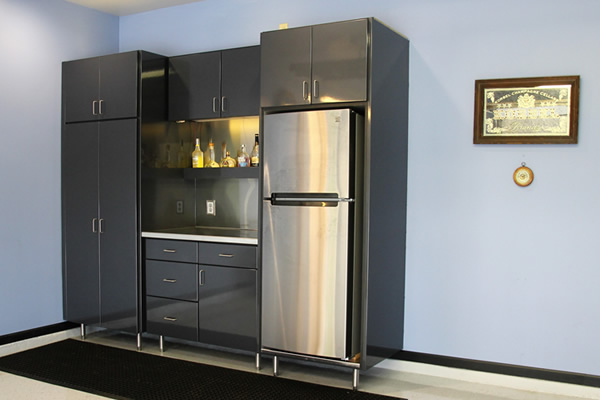
We designed a flexible pantry storage with home owner friendly adjustable height pull out shelves.  This pantry also has a custom stainless steel counter top and a stainless steel full height backslash, lighted bar rail.  The brushed stainless steel legs are 6″ tall to allow for ease of cleaning under the cabinets  The thermo foil cabinets, doors and drawer fronts are great for durability and clean easily. In addition, the stainless steel drop pan below the refrigerator is to  prevent damage from moisture from refrigerator condensation. Finally, the ball bearing drawer slides for ease of use in any temperature.

Also, this cabinet will work well if additional cabinets are added in the future!

Bathroom Design Challenge Winning Design

Congratulations to the Small Bathroom Design Challenge winner:

Design Winner, Kris Schwalenberg
KMS Designs, LLC
(414) 915-7703

Thank you to our generous sponosors:

  • Dave Markweise with Nationwide Floor & Window
  • Chris Holum with Kohler
  • Tariq Shamali with Granite and Marble by Design
  • Mike Ziemba with Apline Plywood
  • Gail Gagner with All County Electric Supply
  • GM Lighting
  • Wilsonart

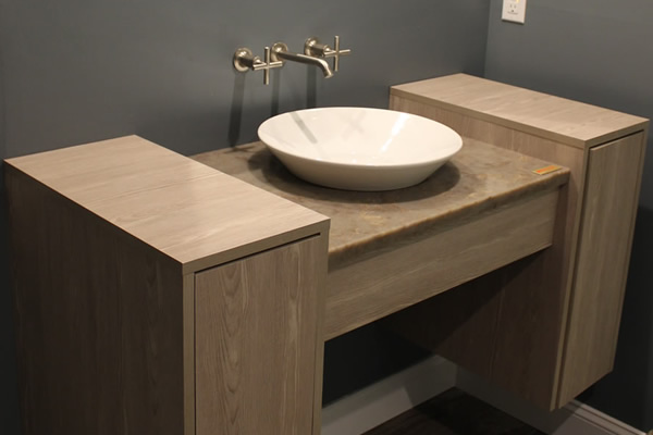
Products used include:

  • Kohler Memoirs Stately Comfort Height Toilet with touchless flush
  • Kohler sink basin, Watercove
  • Kohler faucet, Purist wall mount
  • Daltile floor tile Season Wood-Autumn Wood
  • GM Lighting LED Wall Sconces Constellation Series
  • GM Lighting LED recessed can lighting
  • The Cabinet Maker, LLC custom floating vanity with side storage

1970’s Home Upgrade

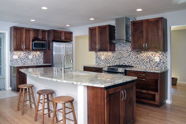
Imagine the homeowner’s delight with the finished creation, with extras galore! These included LED task and ceiling canned lighting, corner drawers, custom pull out storage, double silverware drawer, waste/recycle center with assisted open/close and adjustable shelving in the base cabinets. The focal point was a one-of-a kind, tiled wine bar niche on an accent wall

Have a great idea? Like this homeowner, you can trust The Cabinet Maker to bring your vision to life.

Creative and Functional

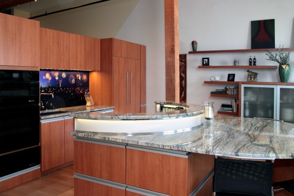
The owner of this 3rd Ward loft condo was dissatisfied with the cookie-cutter feel of the builder’s kitchen and had a creative vision for her new kitchen. What we did was help bridge the gap from vision to functionality. The focus would be an island that was truly an original and bring in her personal touch of custom photography on the muraled backsplash.

The finished project is true to the contemporary design of the condo, and includes a linear concept softened by the rounded, two-level island. The island’s down-draft cooktop incorporates easy-access to spices while hiding them from guests who can be right in the action, seated at the extended island.

Key manufacturing wants that were fulfilled include seamless granite (yes, that is one piece), hidden lighting in the arched-accent piece, and easy-access cookware storage. Other design details include integrated handles that continue the linear feel, and custom panels that camouflage the refrigerator. The drawers feature hands-free access that open with a just a slight bump thanks to the Servo-Drive technology. The upper cabinets feature push-release hinges, negating the need for any external hardware. The waste/recycling center is hidden and hands-free. Finally, the true custom design is highlighted with the seven-foot tall pull out pantry with fully-adjustable shelves and heavy duty soft-close slides.

Have a great idea? Like this homeowner, you can trust The Cabinet Maker to bring your vision to life.

Flow and Functionality

“Open concept” was a foreign concept 35 years ago. Homes were built with lots of rooms. Every space was separate unto itself. The notion that rooms shouldn’t be literally walled off hadn’t taken hold.

This Brookfield ranch exemplified the era. As you can see in the “Before” photo, the kitchen was completely walled in. Single interior and exterior doors were the only access points.

The homeowner had ideas for improvement. Chief among them was making the room less isolated, and more open to the rest of the house. The stage was set for significant, structure-altering changes.

The Cabinet Maker and team partners Story Hill Renovations gutted the kitchen, right down to the studs. As rebuilding began, we opened a wall to create a new access to the living space behind. A second interior doorway emerged.

The new doorway completely changed the room’s flow. Family and friends suddenly had more options to come and go. The space felt less closed off and segregated.

There were other changes too, of course. But walls are often considered immovable objects. The homeowner’s goal of a more open, fluid kitchen couldn’t be realized without addressing this “immovable” fact. The homeowner is glad we did so. We are, too.

Do rooms in your home feel hemmed in? You might have more options than you think. It’s your space – make the most of it. Contact us today to discuss how we can open up your home.

Project for Present and Future Needs

Every remodeling project involves decisions about colors, stains and other decorative elements. Some homeowners fear these choices will limit their future redecorating options. Does remodeling have to be an “either-or” proposition, where you’re locked into certain palettes or designs forever?

This project in a Bay View home offers a decided answer: “No.”

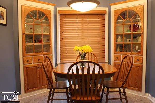
The cabinetry and blinds in the photo offer a good example of remodeling that maintains decorative flexibility. We rebuilt these as part of a larger kitchen project.

The owners wanted to refresh the corner cabinets. They loved the bright, clear look of leaded glass in the older cabinets. Glass would be part of the new, upgraded units.

They weren’t as crazy about the light yellow stain that covered both the cabinets and surrounding trim. This would change – but how?

We started by pulling out the existing cabinets. They were sanded, refinished and sprayed an off-white color. New, decorative glass doors were selected for the top halves.

The contrast – and future flexibility – was added with the doors, drawers and window frames. All were stained with a color that matched woodwork elsewhere in the house. The rich wood tones practically glow.

The cabinets’ window framing were made as arches to mimic nearby arched doors. The blinds – bought from Tim Novak of Budget Blinds in Milwaukee – were color-matched to the stain on the cabinets.

The stained cabinets, and their off-white trim, make a dramatic statement surrounded by the dark blue of the walls. The contrasts simply pop.

Moreover, because of the different shades and textures used, the homeowners are not locked into a monochromatic scheme should they make changes later. “Options” will be the operative term.

Remodeling is often a large investment of time and money. Isn’t future design flexibility what you, as a homeowner, deserve in a finished project? Who says you can’t change your mind down the road?

These are the types of details we keep in mind when considering ideas for your dream living spaces. A project should meet your needs now, and well into the future. Contact us to learn how, together, we can make your home the place you’ll want to be for a long, long time.

A Cut Above

Rick Pues can sit, relax, watch television and cut vegetables all in his living room. No coffee table or other furniture is involved. Pues rolls in a portable cutting block. The 1 1/2-inch-thick hard maple is mounted atop a wheeled cabinet section. He chops, pounds, slices and dices. With the 2-feet-by-2-feet square, there is plenty of space to work. When finished, the piece fits back in line with his kitchen cabinets.

The section’s portability offers alternative options to standing at a kitchen counter. Pues can prepare food anywhere its rolling casters will go. No cutting board is required, putting convenience, function and comfort all in one handy package.

The creation was not born overnight. Pues, who bought his three-bedroom Bay View bungalow in 1998, jokes that he waited 15 years too long to remodel the kitchen.

His patience was rewarded this year. Since January, he has enjoyed cooking and creating in a refurbished, well-appointed kitchen area. Pues is surrounded by new cabinets, new granite countertops, a refinished maple floor, and bright, airy lighting from the ceiling and under-cabinet spaces.

Considered another way, those 15 years allowed Pues to devise some unique ideas. A new kitchen pantry built recessed into a wall was one. The portable cabinet section that fits at the end of the built-in cabinets was another.

Pues originally wanted an island in his kitchen. Its confines would not cooperate. The room was too small and the traffic could not flow, but he did not give up. Pues hired The Cabinet Maker in Oak Creek to remodel his kitchen. When he saw plans for a new bank of lower cabinets, his idea surfaced. The end cabinet section could be a cart.

“It was more than anything being able to have a food preparation area anywhere I wanted it,” Pues said.

The wheeled cabinet piece would be a portable island. He could roll it next to the sink, the oven, into the living room, pretty much anywhere. When not in use, it tucked in next to the other kitchen cabinets.

Pues originally planned to top the cart with granite, to match his new surrounding countertops. John Phillips, of The Cabinet Maker, had another suggestion: How about a thick, durable butcher block surface? Pues quickly saw the wisdom. The heavy wood was virtually indestructible. He would never need a cutting board. The maple block could be periodically sanded and resealed, then returned to use. In short, the hardwood cutting surface would last a lifetime.

“The idea of putting a cutting board on top of the portable cabinet made it much more utilitarian,” Pues said. “You don’t have to put another board on top of it.”

The movable piece is still used as a cabinet. Pues stores pots, pans, a food processor and a pizza oven inside. All are used in food preparation. His goal of a one-stop solution was realized. He admits it took a while to get used to not grabbing a separate cutting board.

“It’s nice to have something you don’t have to worry about destroying,” Pues said.

Many cooks could benefit from this quality of a surface. Cutting and pounding directly on countertops remains is not advised. Doing so risks permanent chips, scratches and incisions in often pricey materials. For those without built-in wood surfaces, a cutting board remains a must-use implement.

“Countertops are made to be used in your home for food preparation, and you have to use common sense,” said Ken Connor of Connor Remodeling and Design in Menomonee Falls. “It’s like a childproof toy – there really isn’t one that’s completely safe.”

Wood butcher block tops remain the most durable cutting surface. Hard-core cooking enthusiasts sometimes build them into counters, Phillips said. Hard maple is the wood of choice. Besides its consistency, the species also poses no risk of nut allergy reactions such as with walnut, he said.

Butcher blocks have to be periodically lubricated. Warning signals include end grain cracking or a dry, weathered appearance. Using varnish is not advised, because it may chip into food. Flaxseed and corn oil are not ideal either.

“Mineral oil is what I recommend,” Phillips said. “The other natural oils can go rancid.”

The traditional pullout wood cutting board is slowly fading away, he said. One drawback is that the board reduces drawer or cabinet space beneath.

In kitchens where pullout boards are still added, their location is usually by a sink or wastebasket. The 1-inch board thickness is supported by heavy-gauge metal slides to withstand the downward pressure of food preparation, Phillips said.

When redesigning kitchens, homeowners usually gravitate to countertop materials with desired aesthetics: the diversity of granite, the shine of stainless steel, or the sparkle of engineered stone, for example.

Ten different materials comprise the lion’s share of counters, Connor said. Some can handle a hot pan. Others resist staining. Each has strengths and weaknesses. All have different maintenance needs.

Like it or not, he said, individuals should not cut or pound directly on any of them.

“You want to protect that beautiful surface,” Connor explained.

Cutting boards are usually located close to food preparation areas. The cookie sheet rack in a base cabinet is typical, he said, or in an island cupboard. An arm’s reach away is ideal.

Some cutting boards borrow from countertops. Corian, a solid surface counter material from DuPont, is regularly used in cutting boards, Connor said.

Some wood cutting boards double as decoration. Different wood species are inlaid in patterns for visual appeal, Phillips said.

Rick Pues did not need anything fancy. While his butcher block cabinet top is attractive, it is also a workhorse surface able to withstand any kitchen tool. Fear of damage is non-existent.

The piece holds a different beauty than his kitchen’s granite countertops. Its mobility is part of its ingenuity. Even though he waited 15 years, Pues ended up with a unique kitchen element that goes where he wants, offering exactly what he needs.

This article, written by Rick Moon of Lunar Communications, was originally published May 18, 2013, in the Milwaukee Journal Sentinel.
A New “Imported” Kitchen

The owner of this Wauwatosa home desired more than a remodeled kitchen. They wanted to replace their cluttered, semi-claustrophic space with a vision imported from 5,000 miles away. Yes, a complete renewal.

The resulting Mediterranean design was a complete transformation. The new arched ceiling overlooks a new tile floor, range hood, exterior French doors and lots of counter space.

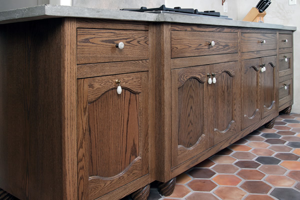
Our cabinetry was a key element in the owner’s plan. Rather than traditional built-in structures, they opted for the warmer feel of a furniture look. Each piece has turned feet at the bottom, reinforcing the Mediterranean feel. The red oak cabinets have inset doors and drawers. Everything about them, right down to the distressed finish, fits into the Italian seaside ambiance.

Beyond aesthetics, though, we designed the cabinetry around the homeowner’s specific needs. The concrete countertops – and one marble top – greatly expand work space. The cook top features usable cabinet space and a wall oven. A waste center drawer has two bins which quickly disappear.

Replace or Repurpose?

Susan Loewenstein is passionate about history. Older, character-laden structures and materials hold a special place in her heart.

Her husband, Zak Otto, shares her passion. It’s a big reason they bought their now 90-year-old Milwaukee home in 2003. The three-bedroom house bears traits of both the Foursquare and Craftsman styles, a testament to the design and building prowess of the early 1920s.

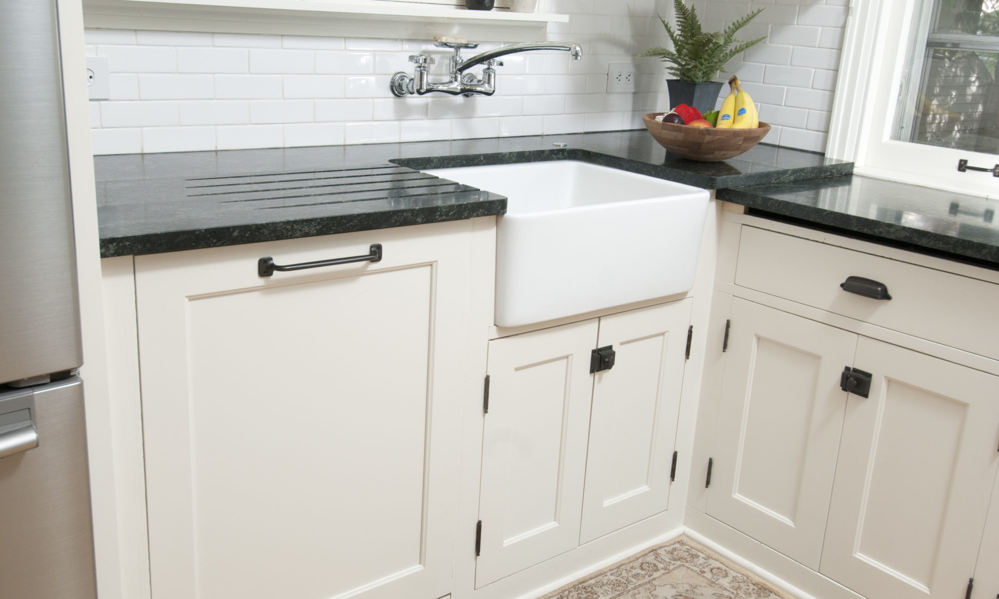
Their family — and its desired living amenities — is modern, though. Loewenstein and Otto faced a quandary when they decided to remodel their kitchen. The space had “a lot of 1920s features,” she said. How could they modernize the room and retain its historic character?

“We really needed to update our appliances, and we really needed more counter space,” Loewenstein said. “We had about 18 inches of counter space.”

The 4-foot-wide sink was original. The stove and refrigerator were each 50 years old. More food preparation space was needed. With two small children — a third has arrived since then — a dishwasher was a must.

The kitchen didn’t lack cabinet space. A large bank of above-counter cabinets covered most of one wall. A tier of cabinets and drawers was beneath. The adjoining wall had more cabinets.

“They’re really beautiful by themselves,” Loewenstein said of the cabinets, which were all original to the 1921 home. “I knew that even if we got all new ones, I’d want them to look the same.”

An idea was born. Loewenstein and Otto decided that, even though many of the kitchen components would be new, they would find a way to keep the existing cabinetry.

A labor of love

The decision wasn’t hard, Loewenstein admitted. They sought quotes for replacing the cabinets. The price was wrong. The look wasn’t right.

The mere notion of scrapping the cabinets didn’t appeal to her, anyhow.

“That goes against my idea of reusing things,” Loewenstein said. “I’ve always liked older homes. I wouldn’t even consider throwing them out.”

Not all the cabinets were salvageable. They’d reuse what they could. Nine decades had yielded an expected amount of warping. Many parts no longer fit together.

The cabinets were just one more item on a long list for Loewenstein and Otto. They remodeled most of the kitchen themselves, working almost daily for six months straight.

The couple pulled up two layers of linoleum flooring and restored the maple floor beneath. They reworked the kitchen’s electrical and plumbing components, and added a new sink and backsplash. They installed new lighting.

The cabinets posed a different challenge. The original maple was buried beneath four coats of paint. Its removal was an arduous, time-consuming process.

“We spent many, many late nights doing this,” Loewenstein recalled. “You can’t work with these chemicals with kids. We’d go out in the garage and strip them while the kids were sleeping.”

The couple even reused the original hinges, boiling off the accumulated paint and shining the metal that emerged.

Loewenstein and Otto couldn’t completely reclaim the cabinets on their own. Some were too far gone. The doors on almost all were seriously warped.

They hired John Phillips of Milwaukee/NARI member The Cabinet Maker to restore the usable pieces, and recreate new ones duplicating the original cabinetry. Their profiles, dimensions and features needed to match perfectly. Phillips, a Milwaukee-based artisan, had to make the old new again, and seamlessly blend the new with the old.

Each piece defined “custom-made.” Replacement cabinet doors had to be precisely planed to match their openings, which were typically off-kilter. The new cabinets — three in all — had to match the older ones in frame and door thickness, right down to the correct inset dimensions in the panel.

“It’s really something that’s unique,” Phillips said. “You’re not going to find this in another house.”

The restored and rebuilt cabinets were reinstalled in Loewenstein’s and Otto’s kitchen. The only giveaway of any change was new handles. Their striving for historic ambiance was complete.

“I wanted to keep that 1920s feel in the kitchen, even though we have modern appliances,” Loewenstein said.

Perfectly charming

Milwaukee is full of older housing stock often loaded with charm and character. Many buyers, such as Loewenstein and Otto, seek homes out for this exact reason. Most seek to retain the historic feel as much as possible.

Reusing and repurposing fixtures might seem like a natural. Original materials guarantee authenticity. The wild card is their condition. Can they be restored and, if so, what will it cost?

“The drawback is you need to get materials back to stock grade,” Phillips explained.

Reworking older pieces involves milling and machining, processes that inevitably remove material. The margin for error often is slim. The risk, Phillips said, is that there might not be enough material left to work with. Costs can be driven up if machine blades are broken by screws, bolts and nails hidden within the material.

“You’re putting more time and expense into just getting it where you can work with it,” Phillips said.

Perhaps Loewenstein and Otto were lucky with their cabinets. A frequent scenario is that homeowners will replace cabinets in their kitchen, and reuse the old ones in a garage or second home, said Ray Shelton of Artisan Kitchen & Bath Gallery, Wauwatosa, also Milwaukee/NARI members.

Old doors are sometimes reused. After substantial milling, they are reborn as serving trays or tables. The refinished wood grain appeals to those with antique tastes, Shelton said.

Think before you toss

Remodeling doesn’t necessarily equate to waste. Demand exists for fixtures and materials that can be reused. The Habitat for Humanity ReStore in Wauwatosa accepts a wide range of tools, supplies, furniture and appliances in good condition.

The donated items — which are eligible for a tax deduction — are resold to fund the organization’s homebuilding in Milwaukee. Old materials find new lives in the homes.

Much is new in Susan Loewenstein’s kitchen: countertops, lighting, appliances, the sink, the dishwasher. Yet every time she opens a cabinet, she reaches back into history. They saved the best, and made it last.

This article, written by Rick Moon of Lunar Communications, was originally published May Jan. 28, 2012, in the Milwaukee Journal Sentinel.